Announcement

Collapse
No announcement yet.

can anyone help me with Wordpress? Revolution Slider specifically

Collapse
X
 
  • Filter
  • Time
  • Show
Clear All
new posts

  • can anyone help me with Wordpress? Revolution Slider specifically

    I need some help with Hero pics and scaling. I would appreciate any advice.


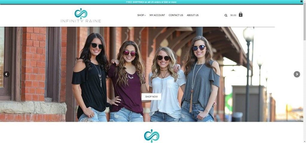
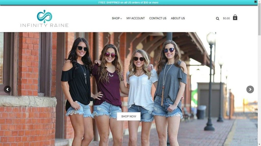
    Essentially the main image on this page is being scaled to fit, the client (my wife and her business partner) want to see more of the picture when viewed on a desktop, but also want it to look good on a mobile device. I've stumbled through the settings, but I am struggling with making sense of it in regards to multiple resolutions.

    www.infinityraine.com is the site. Main picture.

    Thanks in advance

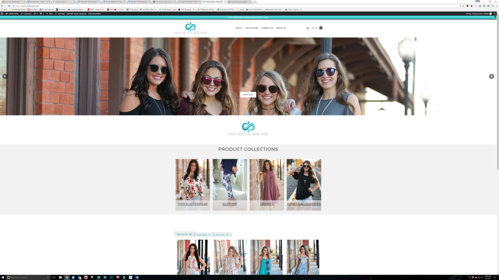
    I feel like the settings should be in here somewhere, but can't seem to make it work the way I want. I am not the professional they hired for their website development BTW. They have a company, but I do not care for how they talk to people, they just can't fire them..... yet
    Last edited by CWO; 07-24-2019, 04:14 PM.

  • #2
    this is the same image uploaded to the media library

    as shown on a large monitor:


    as shown on a 1366x768:


    The request is to always show as much as the picture as possible while maintaining aspect ratio.

    Surely I'm not asking for too much.

    Comment


    • #3
      same image size at 4k

      Comment


      • #4
        You need to use a responsive theme that will auto adjust content on the page to the resolution of the device.

        Comment


        • #5
          Originally posted by abecx View Post
          You need to use a responsive theme that will auto adjust content on the page to the resolution of the device.
          Thanks. I'm watching a video about that now.

          Essential Jedi training for creating responsive sliders. Part 1 explores Layout and Grid Size options and how they impact your slider's responsive behavior...


          The image loaded is loaded as a background. I have a feeling it is supposed to be loaded as a layer.

          BTW, here is the response from the web guy I asked for help.


          Hi Tim,

          I think I remember us having this discussion before, but I will do my best to help here. The good thing is – WordPress is not doing any kind of formatting itself.

          Can I assume you are only talking about the “hero” image/s that are on the slider of the home page?

          At this moment on infinityraine.com, on my screen, I see a picture of the 4 young lady models in sunglasses with hands on each other’s’ shoulders. If I view the page source, the image size that is being rendered to the site (on my screen) is 1903 x 600px.
          The actual image is here: https://www.infinityraine.com/wp-con...14171_1920.jpg
          The data on this image is:
          File name: Thatcher-Photography-14171_1920.jpg
          File type: image/jpeg
          Uploaded on: January 31, 2017
          File size: 363 KB
          Dimensions: 1920 × 1122


          So, for this image/photo, the size is actually 1920 x 1122. But, if the entire image were being shown on a screen of my size, the user would have to scroll down before they would seen any text or call to action (or the Infinity Raine logo in this case).
          If [we] want to keep the slider the size that it is right now – leaving room at the bottom for the user to see the logo (or text or whatever), then the image must be able to fit into the frame of 1920 x 1122 on my screen – and all that [you] want to be seen must be within those boundaries.

          So you may be asking, “ok, so kelly, why won’t you just say make all photos 1903 x 600px and stop making it so complicated?”. And I can certainly understand the potential frustration.
          But as you may have read here, all of these numbers are specific to the size of my monitor.

          If I look at the exact same image on a monitor that is a different size (say 1366 x 768px), the image that is displayed (same picture) is rendered to the screen is 1355 x 600px. Nothing has changed in the coding, and we aren’t using a different image. The amount of the screen taken up is just different. Takes into account the physical size of the image, the frame of the slider that it is in as well as the responsive coding that allows the page to be mobile-responsive without extreme changes.

          So now we would both be asking each other – ok, which size do we “shoot” at or crop images to in order for them to look “correct” on the website.
          And my answer is still the same. It’s not about the px size or the resolution of the image. It is about the content that you want viewed.
          For instance, if it is this image, and the desired look on the site is to have all 4 girls shown and be able to see sky above their heads and ground below their boots – regardless of the screen size, then the photo must be taken from further away allowing more room on the smaller screens. We can always crop down – but we cannot “grow” an image.

          As you can see below in my examples, the top one shows cropping just below the wastes of the girls on my large screen. And on a smaller screen, you can see down below their knees. In order to have the same aspect ratio show up on any (or most) screen sizes, the picture needs to be taken from further away and be as high in resolution as possible. That way, once we determine (design) the size of the slider frame, we can make the content of the picture show up the way you want it to regardless of the actual pixel size/s of the photo.

          Does this make sense given the examples??

          One thing we could do is to hard-code the slider into the site, and that way all screens will see the responsive version of the same thing – and then we can force images into that size. The issue there is going to be less than a positive experience for people on tablets and phones. And unfortunately, that is where a lot of traffic is coming from.

          If memory serves correctly, you guys have a professional photographer taking these photos, and the originals are like 5000+px x 3500px or something. The size and resolution of these are perfectly fine. Plenty for our creative team to work with. But, the content in the picture needs to be further away to allow for cutting down into the frames that they must fit. Then, let us know what you want out of the image – and we can make it happen.

          Comment


          • #6
            The image uploaded is just not the right aspect ratio. Basically. The slider frame is now 1920x600 after I changed it from 1170x600.

            Unless I'm an idiot, and that is debatable, why can't we just upload a 1920x600 or (3840x1200) and call it done? The responsive stuff handles the rest once it's set up, does it not?

            Comment


            • #7
              Responsive should scale the image to fit, unless its told the image is static in size. I would look for height/width tag statically set instead of it using CSS.

              Comment


              • #8
                No one wants to see a whole god damned image taking the entire background when they go to a new website. IMO simple is better on websites.

                Comment


                • #9
                  simple is better not only to craizie but also to googles search algorithims

                  Comment


                  • #10
                    Can anyone take over website maintenance for my wife's website? She wants to fire the current company.

                    PM me please

                    Comment

                    Working...
                    X